As part of my web design course I have to undergo a test. The time had come to do it and I was nervous about it as I was not allowed to get any help from either my tutor or my fellow students. The test comprised of creating a portfolio website to showcase the websites I have created and all the other material I had created in Adobe Photoshop and Adobe Illustrator. I also had to do a theory assignment but thankfully I had completed that in February 2013 when I was in between projects.
I started on the test on the Monday. I had an idea for the site logo. I would use the logo which had been rejected by my client. Waste not, want not! I stretched the logo out, put new text on it and once I was happy with it I worked on the colour scheme. I was going to use Adobe Kuler to create a colour scheme from my logo. Unfortunately I was not able to do this as Kuler had recently been updated and this faculty was temporarily gone from the site. So I had to use Photoshop to pick out colours from the logo and use the colour scheme designer to choose complimentary colours. I picked a bright colour scheme. I showed it to my tutor Martine who was not allowed to pass comment on it as it was part of a test. However, shortly thereafter she announced to the class that the best way to present a portfolio website was to use dark complimentary colours. I took the hint and changed tact and decided to use dark greens for my site. I showed it to Martine who seemed happier with it.
The recycled logo for my test site
I decided more or less to utilise the work I had done previously in my project two site although the dimensions of the test site would be slightly smaller. I had to do a wireframe diagram of the home page which I quickly got through. The next day, Tuesday, I started on the code for the home page. Unfortunately when I ran the code the slideshow which was meant to have a background of a frame (which I created in Photoshop) was nowhere to be seen and the slideshow was not running smoothly, it looked jittery. I couldn’t fathom what was the matter so the next day I decided I would leave it for another time and proceed onto the next page.
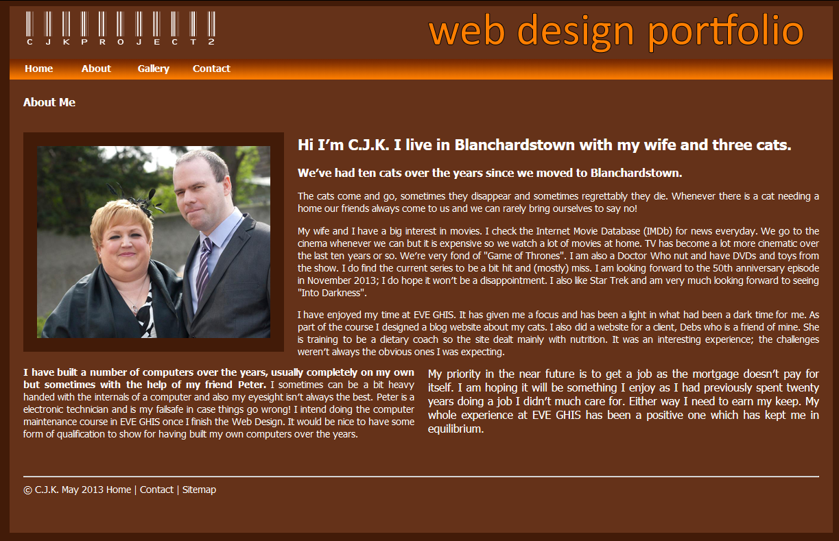
This was the about page which consisted of a photo of me and a blurb about myself. Writing the blurb took longer than the actual coding. However, once more there were problems, neither the photo nor the text were in the right place. I stuck at it until the end of the day but it was still unresolved.
The next day was Thursday and I wrote the code for the contact page. This was relatively simple as all I had to do was copy the code from my previous web site. The code ran as it should, no problems thankfully. I then moved onto the photo gallery page. I picked six images from my work in Photoshop and Illustrator and what was meant to happen was that once clicked they would appear in a lightbox slide show. Yet again I hit some snags. The thumbnail images weren’t in the right place and the lightbox slide show didn’t work. This was very disheartening.
The weekend came so I had two days away from all the coding. This obviously did me some good as when I came in on Monday I solved a lot of the problems I was having. I got the lightbox slideshow working on the portfolio page when I noticed there was a apostrophe in part of the javascript code; it hadn’t worked for that sole reason! I also sorted out the thumbnails to my satisfaction too. I also fixed the about page although the text wasn’t quite laid out as I liked when viewed in Safari & Chrome web browsers but it looked fine in Internet Explorer & Firefox. But it was good enough. I had managed to sort out two out of three problem pages and had just had one left to tackle.
On Tuesday I gave the home page my full attention. I just couldn’t see what the problem was. I was considering taking out the slideshow altogether and just showing four thumbnails of my other websites. However near the end of the day I spotted something, the slideshow was called “SlideShow” in the HTML but was called “slideshow” in the CSS. This meant that the CSS code for the lightshow wasn’t being run as it was titled incorrectly. So once I changed it to “SlideShow” in the CSS the slideshow stopped being jittery and ran properly. As for the frame, I just couldn’t get it to appear behind the slideshow so what I decided to do was give the slideshow a border. This looked well so I was happy with it.

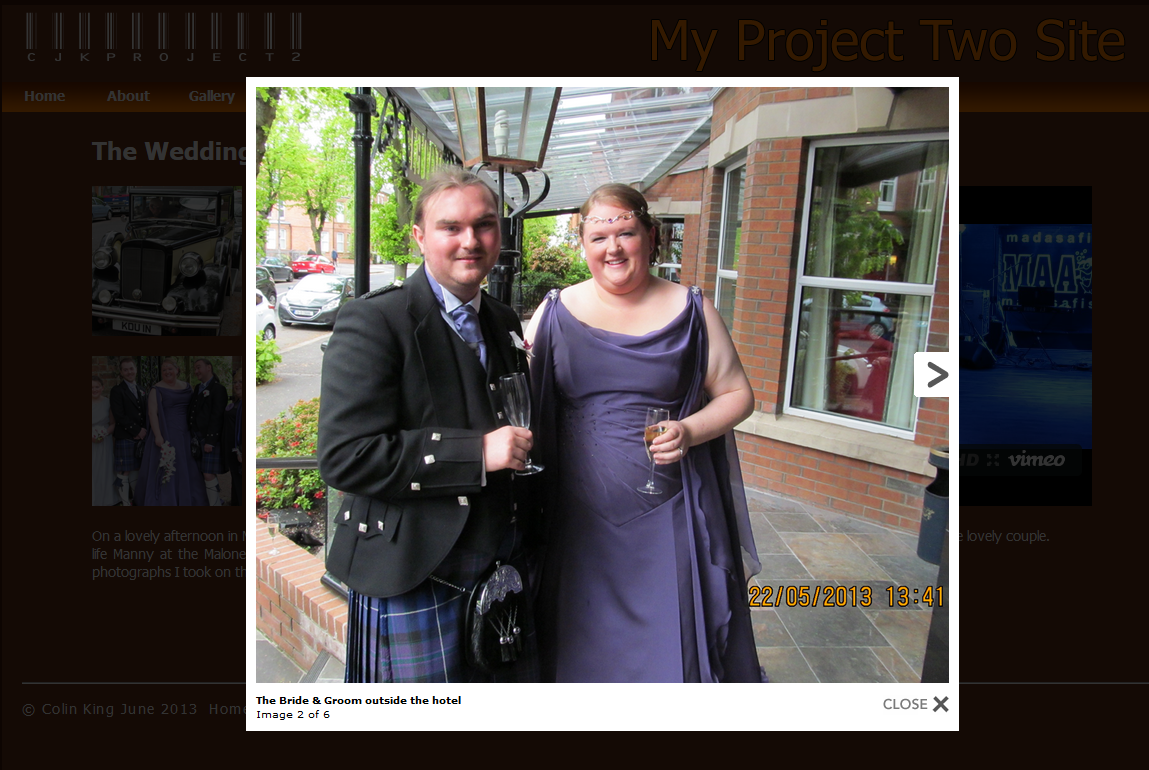
The Lightbox Slideshow on my Portfolio site
The website was more or less finished. I added a links page which showed a sitemap. Then I had to validate each webpage, check for any mistakes or omissions and then upload the site. I was very pleased with the colour scheme of the finished site. I had there weeks to do it and I had done it in under two. The testing time was over and I had done well…